We make it work
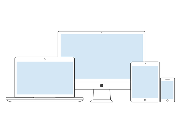
We create websites adaptable to all devices and screen sizes in terms of both form and function—because the majority of users won’t use a website that doesn’t work.
We take several design considerations into our approach such as:
Slow connections: Websites that don’t load in under four seconds run the risk of losing 25% of their visitors. Prioritizing features and content on smaller screens
Making it fit vs. making it work: Considering mobile websites are notoriously awkward as users typically interact with taps rather than clicks, we focus on making such websites work rather than the UI fit into the screen.
Responsive design breakpoints: Responsive breakpoints are specific milestones on the screen size spectrum that may sometimes reap special attention due to their hold on the market share.
Screen resolution and load times: Optimize by serving high-resolution images on high-resolution devices only OR keep resources as SVG instead of JPG/PNG.